
An author choosing a chart type needs to see output, not read a list of builder names. This page is the only place in the vault where charts are the subject rather than the evidence, so every figure below is a real echart fence rendered through the same pipeline as any other chart on the site. The values are sample data. The rendering is genuine, which means this page also works as a live check that the whole chart path still produces figures.
Trends and rankings
Reach for a line or area chart when the order of values carries the meaning, and a bar chart when categories are independent or the labels need room. The horizontal bar keeps long category names readable where a vertical axis would crowd them.
Shares, density, and relationships
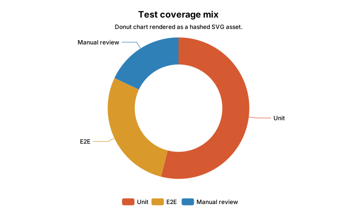
A donut answers a small part-to-whole question. A scatter plots two numeric axes against each other. A histogram shows the shape of one numeric distribution, and a heatmap turns two categorical axes into a grid of intensity. The scatter below opts into visible hydration, so it becomes interactive once it scrolls into view.
Hierarchy and weighted flow
Treemaps and Sankey charts show what bars cannot. A treemap nests numeric weight inside categories, and a Sankey chart shows measured movement between stages. This is where the selection rule bites. If the links between stages carry no measured value, the structure belongs in Mermaid instead, and the index page states that rule in full.
Spread and finance
Boxplots summarize spread across groups without plotting every point. The finance helpers go further, into chart shapes a normal article rarely needs, such as candlesticks paired with a volume pane. These earn their place only when the data is genuinely market-shaped.
What the catalog proves
The catalog proves range more than it proves any sample number. A journal article can show trends, shares, distributions, matrix intensity, relationships, hierarchy, weighted flow, spread, and market data without leaving MDX and without shipping a client-only chart. Every figure above rendered to SVG during the build, which is the same claim this whole section makes about the site.
The rule holds across all of them. Prefer static SVG. Add a file artifact when HTML weight or reuse makes it worthwhile. Add hydration only where a reader gains something by touching the chart. The echarts page explains the machinery behind each of those choices.