This page is a small field guide for the chart shapes available to journal authors. The values are sample data, but the rendering path is real. Each figure below uses an echart fence, so the examples double as a practical check on the chart pipeline without needing MDX imports.
Trends and rankings
Use line and area charts when the order of values matters. Use bar charts when categories are independent or when long labels need room. The first chart below stays static. The second uses the same line builder with an area fill. The third uses a horizontal bar layout for labels that would crowd a vertical axis.
Build output trend - Line chart rendered as inline SVG.Drafting throughput - Area chart using the line chart helper.Publication work by layer - Horizontal bars keep long category labels readable.
Shares, density, and relationships
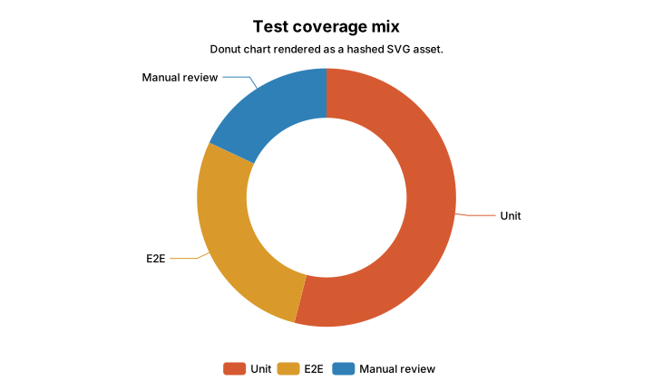
Use a donut chart for a small part-to-whole comparison. Use scatter charts when both axes are numeric. Use histograms for one numeric distribution. Use heatmaps when two categorical axes create a grid of intensity, and use correlation heatmaps when the values range from negative to positive relationship.
Test coverage mix - Donut chart rendered as a hashed SVG asset.
Article length and read time - Scatter chart with visible hydration for inspection.Paragraph length distribution - Histogram generated from raw values.Publishing activity - Heatmap by weekday and time of day.Signal correlation - Correlation heatmap using a fixed negative-to-positive scale.
Hierarchy and weighted flow
Treemaps and Sankey charts are useful when simple bars cannot show the structure. A treemap shows nested numeric weight. A Sankey chart shows measured movement between stages. If the links have no measured values, use Mermaid instead.
Publishing effort - Treemap for nested contribution weight.Publication workflow weight - Sankey chart for quantified flow between stages.
Spread and finance charts
Boxplots summarize spread across groups without listing every point. Finance helpers go further and provide chart shapes that normal article builders do not need, such as candlesticks with volume panes and momentum indicators.
Build duration spread - Boxplot comparing local, CI, and preview build duration.Example equity tape - Candlestick chart with a linked volume pane.Close price and RSI - Finance helper for a momentum pane.
What these examples prove
The examples prove the authoring range more than the sample numbers. A journal article can now show trends, shares, distributions, matrix intensity, hierarchy, weighted flow, spread, and market data without leaving MDX or depending on a client-only chart.
The rule remains the same across every figure. Prefer static SVG. Add file artifacts when HTML weight or reuse makes that useful. Add hydration only when the reader benefits from inspecting the chart in the browser.